Hi everyone, Sharmaine here with not one but two layouts using the new Milkshake Chic range from FabScraps.
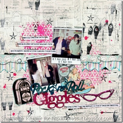
The first page I created was this fun one that features papers from the range as well as clear stickers and chipboard.
The first thing I did was to add some colour and texture to the funky glasses.
Then it was a simple case of mixing some X-Press It Tripletac Glue with some glitter
And smearing a generous coating to the chipboard
And smearing a generous coating to the chipboard
Once it was dry I added some FabScraps Rhinestones to the glasses
I used the Jukebox sticker on my page and backed it with some of the pattern paper.
Another tip is on how to alter the clear stickers.
Sometimes you don’t want the clear stickers to be totally clear.
So take the stickers and a piece of old book paper
Sometimes you don’t want the clear stickers to be totally clear.
So take the stickers and a piece of old book paper
Then lightly place the sticker on the paper and then lift.
The paper should stick to the back of the sticker.
The paper should stick to the back of the sticker.
You will be left with some of the text on the back of the sticker.
You should be able to rub off any text you don’t want.
You should be able to rub off any text you don’t want.
I also used some of the pattern paper to create a banner
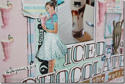
The second page I created was inspired by the piece of pattern paper that was filled with milkshakes.
Again I cut, and used, one of the images from the pattern paper.
I also ruffled the skirt on the image, to give some texture and dimension.
I also ruffled the skirt on the image, to give some texture and dimension.
and the awesome chipboard milkshake (with a cherry on top!)
I left raw and placed it on top of a layer of other milkshakes
(namely a sticker and pattern paper print of milkshakes.)
I left raw and placed it on top of a layer of other milkshakes
(namely a sticker and pattern paper print of milkshakes.)
The gorgeous retro colours and images definitely make you want to sit awhile in a milk bar, sipping on a milkshake and listen to the jukebox… don’t you think??
Happy creating
Pin It
Happy creating


No comments:
Post a Comment